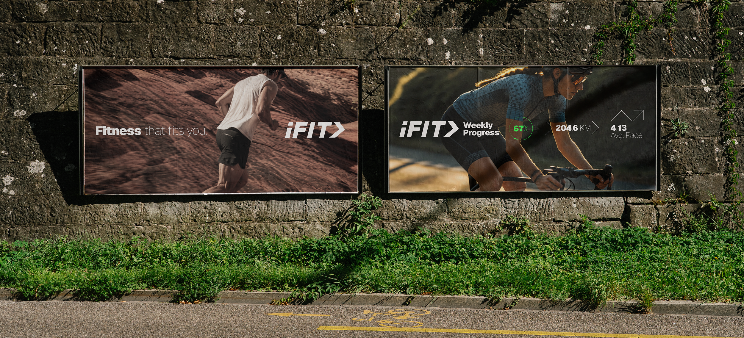
Project Overview
The iFIT 2026 Brand Guide represents a full visual identity evolution — establishing a cohesive design language built to scale across the entire iFIT ecosystem. From color and typography to tone of voice and application standards, this rebrand unified how iFIT shows up across every consumer touchpoint, marketing channel, and platform experience.
In collaboration with Creech — Creative Director, brand strategy, design system, and cross-functional rollout.
The Platform Behind the Equipment
iFIT powers the connected fitness experiences behind NordicTrack, ProForm, and a growing portfolio of hardware and content brands. As the ecosystem expanded across hardware, software, content, and enterprise, the need for a singular ownable identity became critical — one that could hold premium weight in consumer marketing, flex across sub-brands, and anchor a platform that millions of members interact with every day.
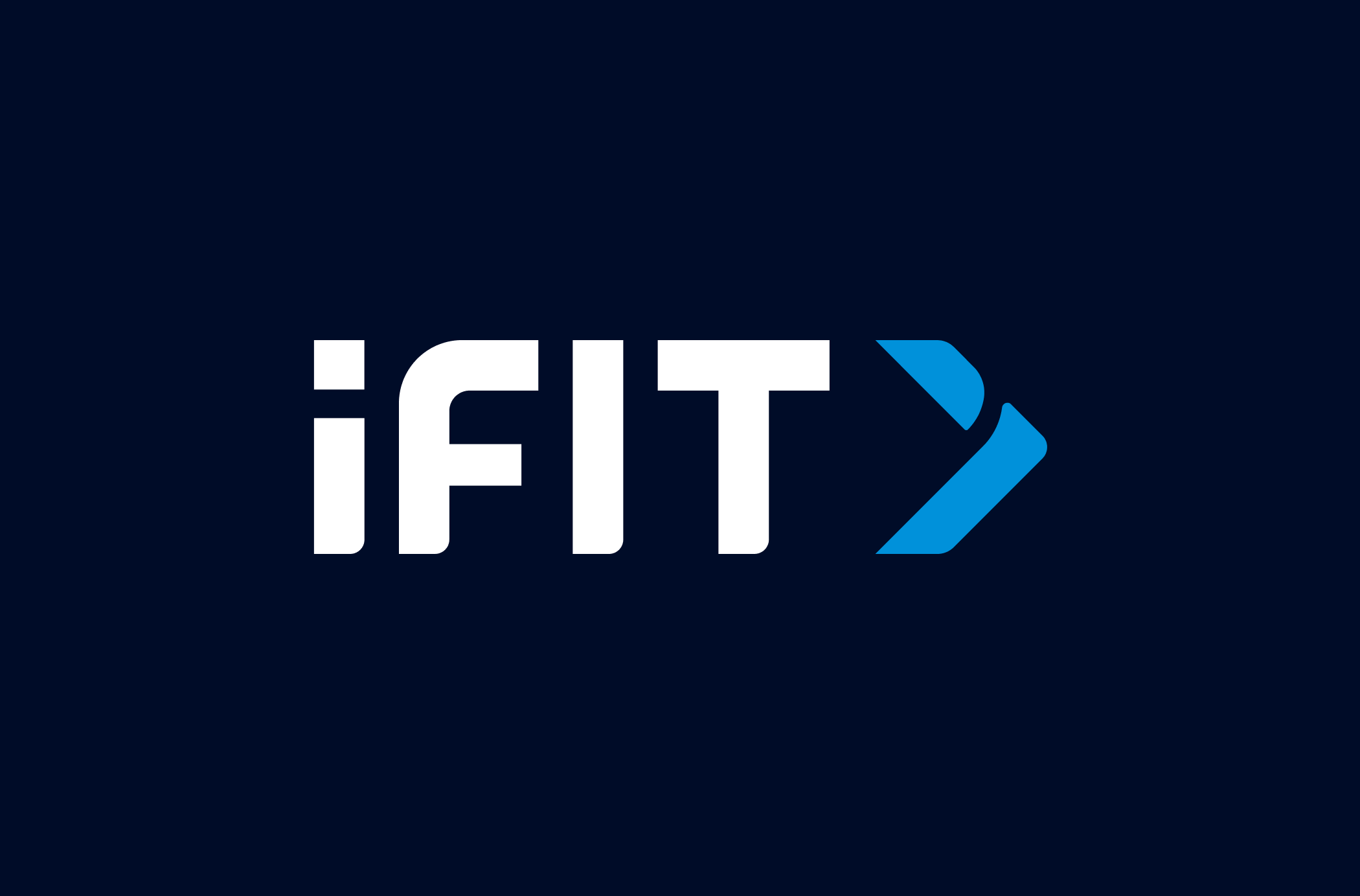
Before
iFIT wordmark, from ~2020-2025
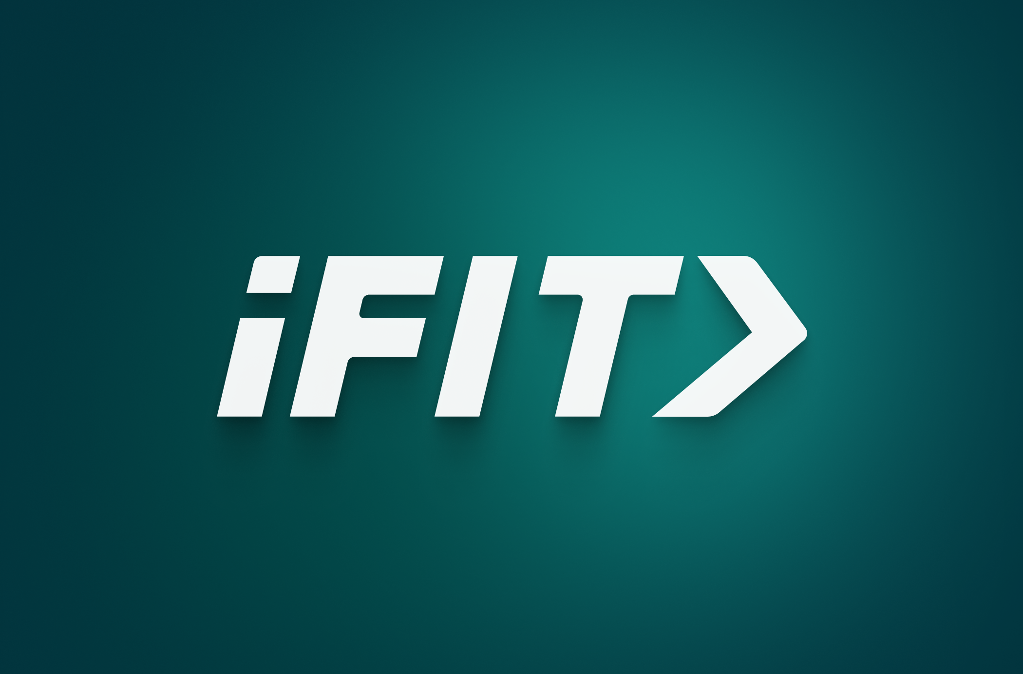
After
iFIT wordmark, Dec 2025+
The logo went through multiple rounds of consumer insights before landing here — tested, challenged, and refined into a mark built to anchor a full brand ecosystem, not just a product line.
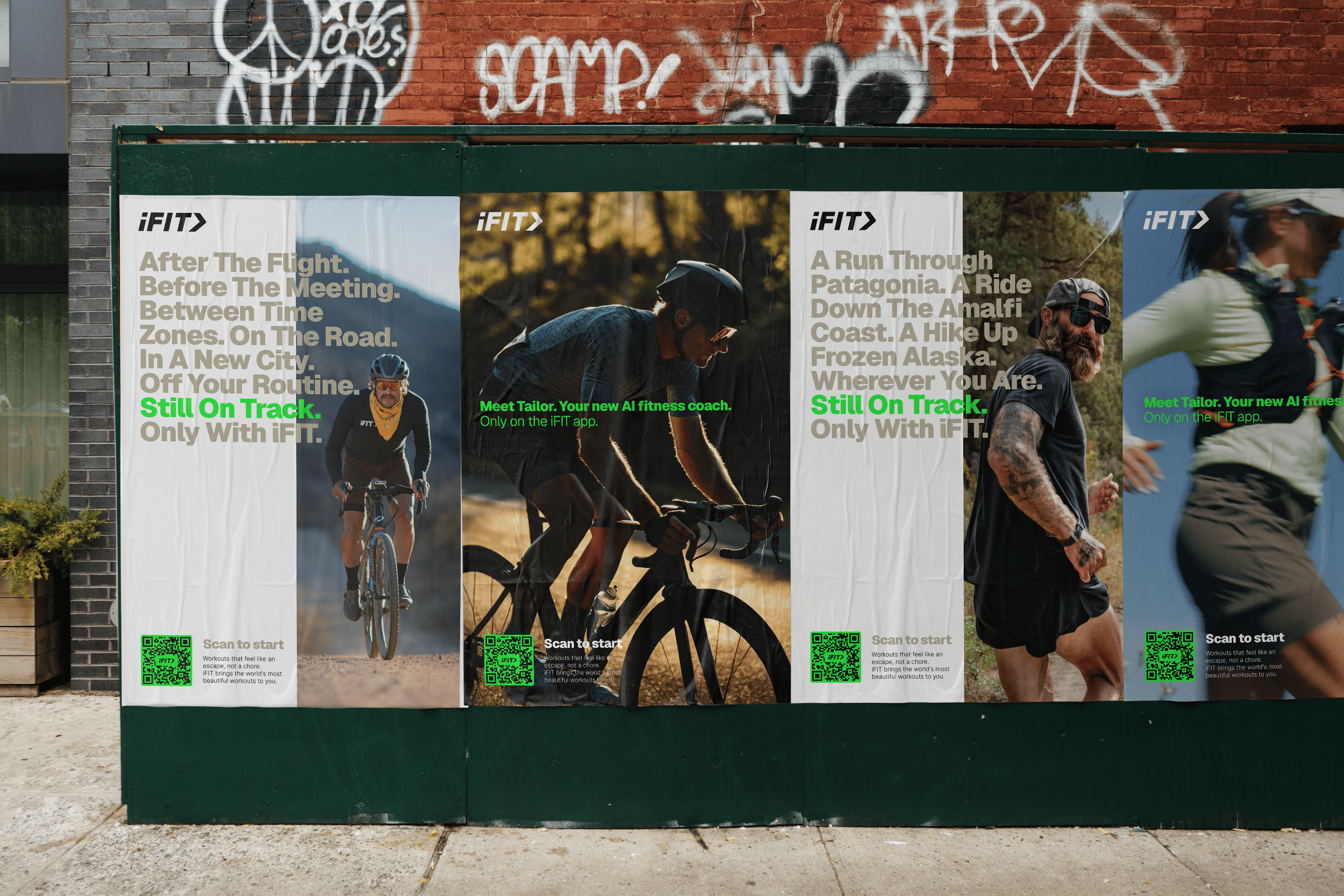
Logo animation
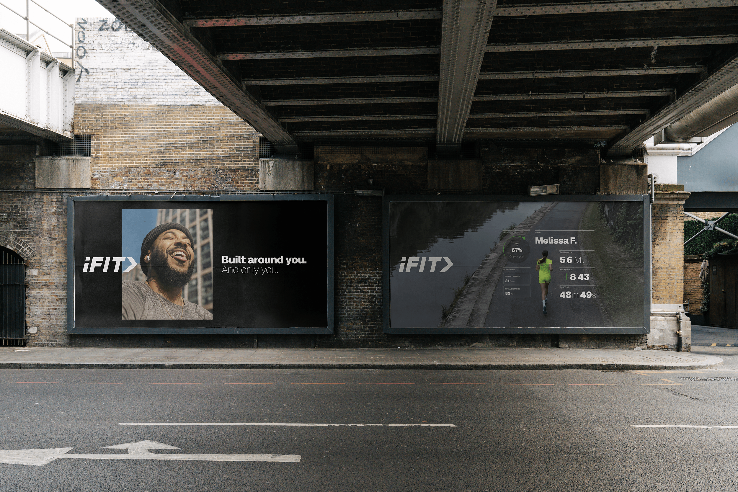
The iFIT arrow was animated to move the way the brand talks about progress, forward, deliberate, never static. Used across OOH takeovers, social cuts, and in-app transitions, the same motion system scales from a subway platform down to a loading screen, keeping the mark consistent everywhere it appears.
Beyond the Screen
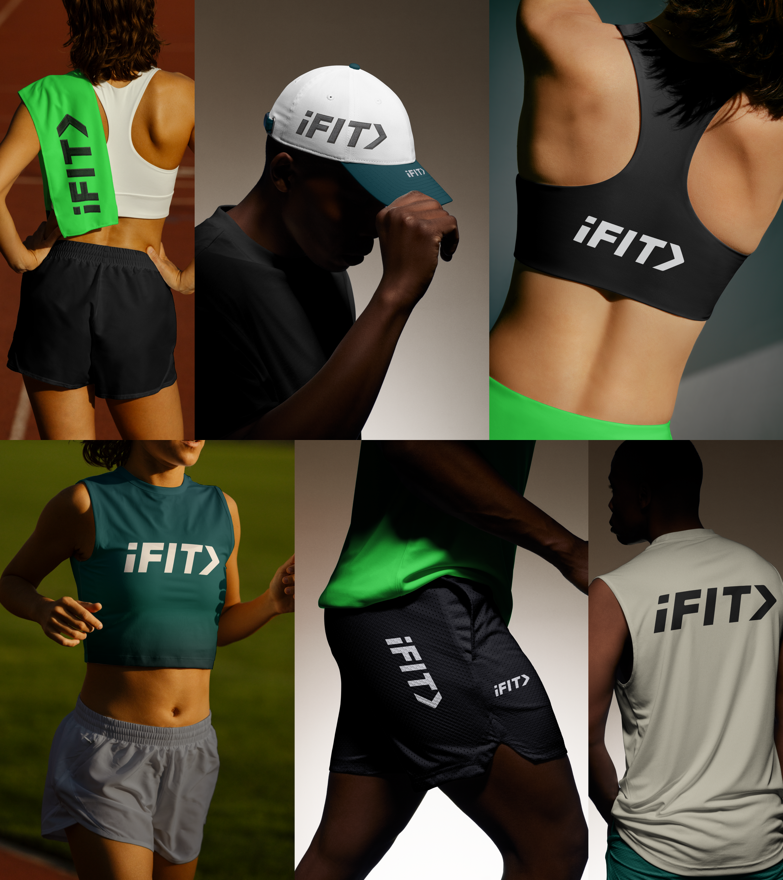
As part of the rebrand, I explored how the new wordmark could live on iFIT trainer apparel, testing placement, scale, and color across tanks, caps, and performance wear. While this concept never went to members, it helped pressure test how flexible the new identity could be on physical product.